
Wednesday, February 7, 2018
Target Audience Research - Better Homes and Gardens

Tuesday, February 6, 2018
Target Audience Research - HGTV
 Through our research, we found that this magazine is very similar to ours. It offers creative do-it-yourself projects and easy home decor. We found that the majority of their readers are female (approximately 60%) which follows the pattern we have seen with similar magazines. For this magazine, the age range was slightly lower than that of the the magazine we looked at, ranging from around 25 to 54 years old. This magazine had the largest age range of any of the ones we looked at. They also had some readers that were between the ages of 18 to 25, but they were the minority. We also found that the majority of the readers of this magazine are home owner and 40% had a college degree. This means that there is a large number of people who have free time at home to simple crafts and redecorate their homes, but also have the funds to do so. HGTV advertises their magazine through their television channel. In the magazine, they feature advice from trusted experts, and in many cases people that are seen on their television shows. They rely heavily on the fact that they are a well-known brand which has proven successful to them. They also have a website that advertises their television channel as well as their magazine. They also have a twitter, pintrest and Facebook account where they have pictures from homes or decoration tips as well as specific boards for shows such as Fixer Upper and Brother Vs. Brother
Monday, February 5, 2018
Target Audience Research- Our Magazine
For our magazine, we decided that our product would appeal most to stay-at-home parents or anyone who enjoys crafting or home decor. We estimate that the age of people who would be reading our magazine will be around middle-aged men and women. Our magazine isn't really location specific so it could be distributed nationwide, meaning in the United States. Furthermore, the topics in the magazine are written in a relatively easy to understand format so our intended consumers would only need above an intermediate level of education. Since we are targeting middle-aged men and women, we estimate that the average income level of our consumers would fit in with the national average of around $32,000. Overall, this magazine would be suitable for anyone with a creative mind.
Wednesday, January 24, 2018
Target Audience Research - Good Housekeeping

Friday, January 19, 2018
New Project Planning
I decided to change my entire article for my next submission. I felt that the project could be better. I decided to also change the layout of my article. This was a decision based on the feedback I received on my midterm draft. I talked to my partner and we decided that we should streamline the layout of the articles more so that there was unity between the different publications of the magazine. I am planning on completing the new project this weekend depending on my interviewees schedule and availability.
Wednesday, January 17, 2018
New Photo Shoot Location
I needed to re-shoot some of my pictures as I re-did my project, so I decided to change my location. For my previous shoot I did it in my house and on the front porch. I moved to my back porch so that I could show the craft in different locations throughout the house. I also staged some bookshelves with the mason jars so that I could provide a variety of uses for the project.
Tuesday, January 16, 2018
Feedback/ Revisions
I got lots of feedback on my Midterm submission of my magazine. I have decided to change quite a few things in my magazine though. I decided that, on my cover page I would like to change some of the fonts, on my table of contents I want to add some more varied pictures, on my article I need a bigger focus picture, and on my article I am going to get rid of the clip art boarder. For the cover page, I like the picture, but I would like to change up the fonts of the subheadings. I think a more varied font would look more visually appealing and would add some interest to the page. I also want to increase the font size to make them fit in with the picture and heading better. I would also like to add more pictures to my table of contents. I would like to use some more varied pictures that are slightly more "Spring" themed because at the time that the magazine draft was due, it was winter and the colors of the tress and grass was more muted than it would be in spring. For my article, I would like to increase the size of the focus picture on the first page and also increase the size of the picture on the second page. I might also do another photo shoot to take a picture of someone painting the mason jars or doing something else related to the project. For the actual article, I want to remove the clip art boarder. I am planning to either remove it altogether or to take my own picture and use photo-shop to make my own clip art so that I took the picture. I am also planning to get with my partner to format our table of content's to be more similar/ follow our template better. My partner included a small description of each of the articles in her magazine on the table of contents, which we didn't see on some of the magazines we looked at so we have to decided whether we are going to include that or not. We also need to decide how we want to lay out our articles. I put my materials at the beginning of the article while she put it towards the end. I at least want it to be on the same page for each article.
Tuesday, January 9, 2018
Use of Conventions
How does your product use or challenge conventions of your genre, and how does it represent social groups or issues?
For our magazine, The Crafting Corner, we researched many different magazines that were of a similar subject matter. Some of the magazines had articles that were focused on a specific topic; crafting, cooking, or decorating. Our magazine combines all of the topics that we researched. We took ideas from each of the magazines we had researched and combined it to make a magazine that covered more than just one main topic. It allowed us to diversify our articles and create an article that really incorporated all forms of "crafting." In doing this, we both challenged and used conventions in the creation of our magazine. The cover designs and table of contents layout follow the layouts of similar magazines, and our articles have aspects of the articles we looked at, but the layout is also slightly different from many of the articles we looked at.
Additionally, while our product does not have a serious or controversial tone, it allows every-day people the chance to exercise their creative side, either by themselves or with their friends and family. Our article represents "normal" people who turn to art as an escape from the stress of their daily lives.
For our magazine, The Crafting Corner, we researched many different magazines that were of a similar subject matter. Some of the magazines had articles that were focused on a specific topic; crafting, cooking, or decorating. Our magazine combines all of the topics that we researched. We took ideas from each of the magazines we had researched and combined it to make a magazine that covered more than just one main topic. It allowed us to diversify our articles and create an article that really incorporated all forms of "crafting." In doing this, we both challenged and used conventions in the creation of our magazine. The cover designs and table of contents layout follow the layouts of similar magazines, and our articles have aspects of the articles we looked at, but the layout is also slightly different from many of the articles we looked at.
Additionally, while our product does not have a serious or controversial tone, it allows every-day people the chance to exercise their creative side, either by themselves or with their friends and family. Our article represents "normal" people who turn to art as an escape from the stress of their daily lives.
Thursday, December 21, 2017


Friday, December 15, 2017
Magazine Cover Design Template
 While designing the cover of our magazine, we chose to put the title of the magazine in the Pristina font. We liked this font for the title because it looks more creative and crafty. We decided to leave the font black so that we could choose the color based on our magazine. Although we may need to change the color of the font on our magazines depending on the picture and copy we choose to do. We also decided that we wanted the subheadings to be a different font than that of the title so that title would stand out more. We decided to go with the font, Stencil. It is more of a blocky font that looks like it was created with a stencil which again goes with out theme but it's also bold so it stands out nicely. We didn't want to use the same font that was used for the title because we wanted the title to stand out as being the title, it is very obvious what the title is. After careful consideration, we decided to call our magazine "The Crafting Corner." It goes along with the theme of the magazine but also encompasses a lot of different options for our articles. After researching other magazines in our genre, we found that it was common to put the title at the top and the subheadings either in list format on one side or scattered between both sides based on the picture that was used for the cover. We chose to use Stencil as the font for the headings. For our magazine we decided to put the subheadings on either side of the page. This allows the perfect amount of space for the picture to go in the middle of the page and any borders or actual image won't have to be cut off. I contributed the layout of the page and I created the actual page and set everything up. We really wanted too keep the template simple so we could make any changes we needed depending on our issue.
Magazine Table of Contents Design Template
 For our table of contents, we wanted to make sure it went along with those of other magazines in the genre. We noticed that most table of contents had pictures at the top and then the titles with page numbers in a multi-column format. Usually they were arranged in two to three columns which look nice and neat and organized. The font was usually pretty simple and easy to read but it was almost always colored. One was pink while some others were blue and some black. It was more common to see colored text than just plain black. It made the page look organized and full rather than white and empty. For our table of contents, we decided to put the "Table of Contents" at the top of the page in the same Pristina font that we used for the title of the magazine. We laid it out so that the letters would be a color with a different colored outline. We also added some word are so that the title would look more artistic. We decided that the colors will go along with the pictures and issue of the magazine so we just left them pretty simple and easy. Below the title we left some room for a few pictures. In the magazines we looked at, their pictures were usually edited to look like they were an actual piece of paper rather than being even and smooth with the background. They would be turned and rotated and some even had boarders to add interest to the page. This goes along with our "craft" theme so we decided that we could maybe do that for our pictures. Below that we made three columns. Each will have a different title such as cooking, crafts, and gardening but can be subject to change deepening on the issue of the magazine. While doing this we also decided to use the same stencil font for these columns. This keep the magazine looking uniform and neat but stencil is also the perfect font because it is easy to read, bold, and looks "crafty." I contributed the layout of the page, the font choices, and i created the page on the computer.
Thursday, December 14, 2017
Magazine Flat Plan
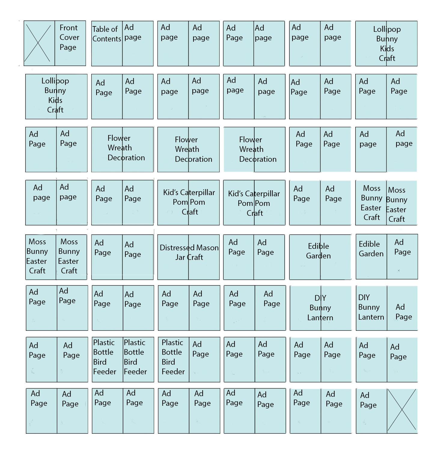 For the magazine, I want to have the article I am writing in the middle. Through my research I have found out that the cover articles are usually towards the middle of the magazine, so that's where I wanted to place mine. I decided to put a lot of ad pages in the beginning and end of the magazine because that's how most of the magazines I researched had laid out their magazine. When choosing the other articles to put in my magazine, I wanted to stick with the theme of spring. I decided that I would have around 30 of my pages filled with actual articles. The rest of the pages are planned to be ads for craft and spring related items. I ended up with 8 articles in total in my magazine. They are about either crafts, décor, or food related crafts and projects.
Monday, December 11, 2017
Photo shoot schedule
I have decided that I want to schedule my photo shoot the same day that I create the craft and conduct my interview. That will most likely be December 16th but if I need more pictures, I will set up an area to take pictures at my house on the 17th. I'm planning on setting up an area to take pictures either inside or outside but I haven't decided yet.
Sunday, December 10, 2017
Interview Questions
There aren't too many questions that I can ask during the interview, but I would like to ask why they like crafting or completing DIY projects. I would also like to ask how they came up with the craft that I am going to feature in my article.
My questions will be:
1) Why do you like to craft and complete DIY projects?
2) How did you decide to create these mason jars?
3) How long have you been crafting?
4) Explain to me how you sand each jar to give it such a weathered look.
I haven't decided if I will put in each quote or just takes bits from the interview and put them throughout the article.
My questions will be:
1) Why do you like to craft and complete DIY projects?
2) How did you decide to create these mason jars?
3) How long have you been crafting?
4) Explain to me how you sand each jar to give it such a weathered look.
I haven't decided if I will put in each quote or just takes bits from the interview and put them throughout the article.
Photo Shoot Location
 I decided to take my pictures at my house. That way I can set up an area to take the pictures. I used wrapping paper and a binder to create the backdrop for the shoot. I wanted it to look very clean and neat to go with the spring theme. For the front cover picture, I am going to set up my mason jars on a porch or inside where they will look like decorations. I was planning on taking pictures throughout the process of creating the jars but I'm not sure if I will use them in the magazine.
Saturday, December 9, 2017
Photo Shoot Location Scouting
I was thinking about doing my photo shoot at my house. I haven't decided whether I want to do it inside or to do it outside. I was thinking about also possibly doing it at the house of the person I am going to interview. I am going to look around this weekend to decide where to take my pictures. I may also look at doing it outside in a more natural environment because that goes with the project I am going to create.
Friday, December 8, 2017
Date Planning
I am going to be creating the craft that I am going to feature in my magazine on December 16th hopefully. I decided to make "weathered" painted mason jars that can be used for a myriad of different things. They can be used as decorations, or used as an opaque container that will hide its contents. I decided to create these jars because my magazine is going to be the spring edition and their pastel colors fit in well with the theme. I am going to write my article that day and edit on the 17th. I hope to be done with editing the article by Monday December, 18th so that I can design the magazine and put in any pictures that I take. I decided that my pictures are going to be of the steps of the craft and the finished product so during each mains step of the project, I will arrange it on a piece of colored paper or wrapping paper as my background. I plan on setting up the craft over some colored paper so that when I am taking the pictures the background is clean and neat. I will probably use a picture of the finished product as a decoration or on a necklace for my cover page. I plan on conducting my interview on Saturday as well. I decided to interview Nicole Swartz for my article.
Tuesday, December 5, 2017
Magazine Research - Better Homes and Gardens
 The final magazine we chose to research was Better Homes and Gardens. This magazine features holiday crafts and festive projects. While our magazine is not centered around the holidays, it is a craft magazine so it will still go along with our theme. The cover of this magazine features a picture of one of the crafts that is featured in the magazine. The title of the magazine is very big and eye-catching with subtitles on the left side of the cover photo. The picture is set up and arranged in such a way that there is little to no extra decorations where the subheadings are. This makes the magazine look organized and well planned out. The articles in the magazine are more centered around the holidays and craft and gift ideas. The table of contents is well organized and visually appealing with pictures above the articles. There are 14 articles in the entire magazine, which is 112 pages. Page 30 features a clay and fabric snowman craft, while page 70 provides a myriad of crafts for kids to do. Each of the articles will include some form of craft, but then at the end of the article there are directions on how to create each of the crafts in detail. There are not that many ads in the magazine and the ones that are blend in well with the theme and style that is repeated throughout. The only obvious ads are on the first page and the back cover if the magazine. They are for organization containers and page 5 contains an ad for craft supplies. The final ad in the magazine is on the back page is advertises clay used to create crafts. The distribution number of the magazine is on average about 7,600,000 magazines per month. It has earned an honorable mention for an Eddie for Women's Lifestyle on an article called Power of Purple.
Monday, December 4, 2017
Magazine Research - Good Housekeeping
 The fourth magazine we chose to research was Good Housekeeping. The cover of the magazine is similar to that of the other magazine we chose to use because it incorporates the "holiday" theme. There are three wrapped presents featured on the cover. They are wrapped in red and green wrapping paper and a positioned so that there would be open area to place text. The title of the magazine is in the same font as all other Good Housekeeping magazines and all text on the page is white with each subtext section appearing to be a different font. The articles in this magazine are focused on holiday guides as well as some DIY gift guides. There are a few articles on "getting into the holiday spirit." The ads in the magazine all focus on either winter/holiday items, gifts, food items, or home decoration items. The first 4 pages consist of two ads. Each spans the length of two pages in the magazine. Directly after the ads there is a table of contents. It is arranged so that the beginning is located on the back of a page, with the front of the next page being an ad. The back of the ad has the rest of the information. This is unlike any of the other magazines we looked at. On average, throughout the magazine there is an add on every-other page. There are ads for Olay on page 7, one for Dove on page 13, one for M&M's on page 25, and an article/ad that goes on from pages 44 to 48D. The circulation of the magazine is 4,652,001 total copies. While it doesn't appear that the magazine has won any awards, it does give out its own, very respected, awards.
Friday, December 1, 2017
Magazine Research - Fine WoodWorking

Subscribe to:
Posts (Atom)


-
 The third magazine we chose is Fine Woodworking. It is slightly more centered around creating wood items at home but fits in well with our...
 -
 Through my research of the Better Homes and Gardens magazine (bhg), I found that they had a similar website layout to that of the Good House...
 -
Although we lacked experience at the beginning of this project, our design, writing and production skills improved significantly during the...